Review: Joker/Harley: Criminal Sanity #1
"Criminal Sanity" - Book One
 Writer: Kami Garcia
Artists: Mico Suayan and Mike Mayhew
Letterer: Richard Starkings
Review By Kendra Hale
Joker/Harley: Criminal Sanity #1 is here, and it delivers not only a beginning to this tale, but 3 beautiful covers as well. One of the genius themes for this series is a defined feeling of duality. We get a beautiful main cover with art by Francesco Mattina, but then are treated with 2 variants by the main artists. We get a Joker version by Mico Suayan and a Harley version by Mike Mayhew, which is stunning. There was a lot of ground laid in this first issue, so let’s dig in.
Joker/Harley: Criminal Sanity #1 is here, and it delivers not only a beginning to this tale, but 3 beautiful covers as well. One of the genius themes for this series is a defined feeling of duality. We get a beautiful main cover with art by Francesco Mattina, but then are treated with 2 variants by the main artists. We get a Joker version by Mico Suayan and a Harley version by Mike Mayhew, which is stunning. There was a lot of ground laid in this first issue, so let’s dig in.
Will Graham Calling
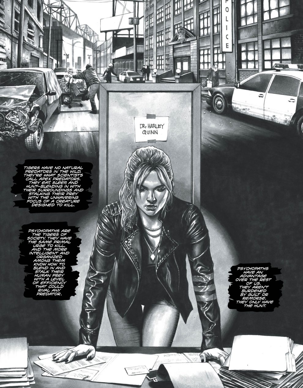
Joker/Harley: Criminal Sanity starts out in a black and white world, with us listening to the inner monologue of Dr. Harley Quinn. The premise is that Harley is a consultant for the GCPD, helping to solve cases involving serial killers. This job change from her previous role was due, in large part, to losing someone very close to her to The Joker. As you’d guess, she’s become a bit obsessed with the case and is struggling with lack of progress over a five year span. Little does she know, she’s not the only one keeping an eye on the case.


Comments
Post a Comment