Review: Red Hood Outlaw Annual #3
"We're Not In Kansas Anymore"
 Writer: Scott Lobdell
Artists: Adam Pollina and Pete Woods (Prologue)
Color Artists: Steve Firchow and Pete Woods
Letterer: ALW Troy Peteri
Review by Fay Clark
So, in this new release of Red Hood Outlaw Annual #3 we get to rock out with my favourite bunch of problem children. Might even add a few to our roster, who knows? We see a lot of Bizarro and his friend Artemis. It all kicks off in this annual; fists and feet and flying. All the F’s and yet, precisely not one single ‘F’ was given. Who’s surprised by that? No one.
You have to love chaos and, in this annual, we get it in troves. Scott Lobdell has given us a fantastic story with some great plot points and twists. This story just filled me with joy, it was definitely big stupid grin time. Lobdell’s writing has been continuously great on this series.
Hall of Spikes
We focus more on the “Outlaws” in this annual and I’m very happy about that, as I’ve always said I think they aren’t used as much as they could be. Lobell it seems is not only great at writing brooding boy, but also at writing angry red girl and large soft boy. To me it’s always more interesting for the plot when Bizarro and Artemis are involved. It really gives the storyline an extra element of “I have no idea what’s happening… but I love it.”
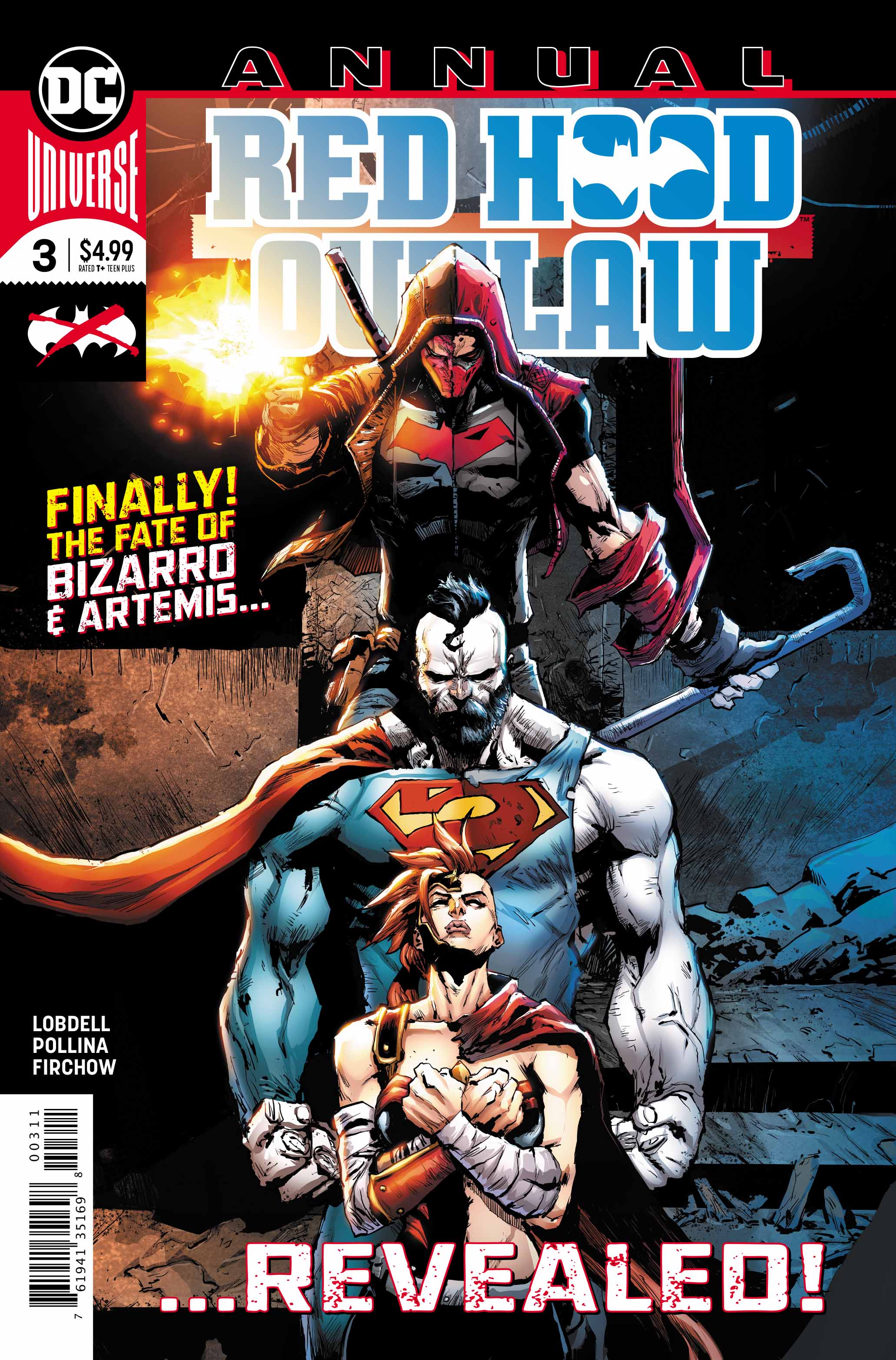
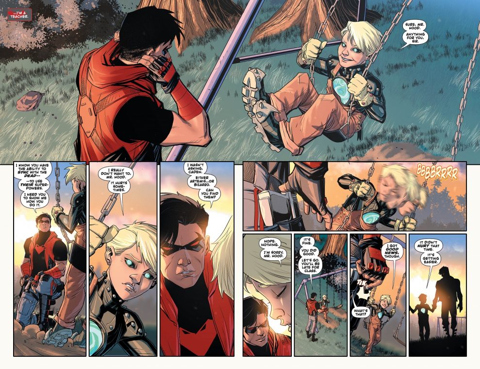
Can we please just focus on the artwork for a second here? Wow! That’s some great stuff, The re-designs for both Artemis and Bizarro are stunning. Pete Woods' dream-like prologue images, and the way artist Adam Pollina has incorporated Artemis and Bizarro's personalities into their new looks is amazing. The colors in this issue are stunning too; the reds and oranges that run throughout the book really tie the pages together. All this makes the story flow very easily, from one panel to the next.
Conclusion
Red Hood Annual #3 is a great, fun read. It kept me entertained and engaged all the way through. I’m so glad that Bizarro and Artemis had their moment to shine and show people what they are capable of. The artwork was stunning to look at and some of the two page spreads where just rife with details. Such dedication should be celebrated.
In short… more please. Very happy to keep reading these Annuals and can’t wait to see what happens next.
Images Courtesy of DC Entertainment


Comments
Post a Comment